FAQ

the blog.

2025 > The Art of the Movie Poster

The Art of the Movie Poster

By Neil Graham

12 Nov 2025

© Something Pointless, Dir. Asa Bailey, Hiraeth Productions, 2025, All rights reserved

I have a long term appreciation for movie posters. The best of them are works of art in their own right, and there is something fascinating about the process of trying to encapsulate a whole movie’s worth of storytelling in one eye-catching image.

As a youngster I collected film poster postcards: they were 20p each and were sold at a small shop round the corner from the Odeon cinema in the centre of Liverpool. I would pick up a couple every time I went the movies. I had them displayed on my wall in my first year at university — they were probably 100 or so by the time I had gathered all the ones I wanted — they formed an interesting visual collage that I can still remember today. It was fun to arrange them into an aesthetically pleasing order — and each new one would lead to a few minutes of re-arranging as the colour scheme and flow would be altered quietly by the arrival of Ghostbusters or Batman.

Now I’m a well into my grown-up years, I’m not allowed to do things like this anymore (!)— pinning favourite images to the wall. At some point in your late twenties, blue tack becomes banned and picture frames become socially compulsory. But I still have a couple today salvaged in my study — Breathless and Alphaville — two iconic movie posters that have, for one reason or another, lodged themselves in the affectionate area of my brain.

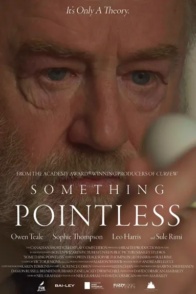
So I thought I would use the recent release into the world of our festival poster for Something Pointless to talk about a couple of wonderful posters that have etched into my memory.

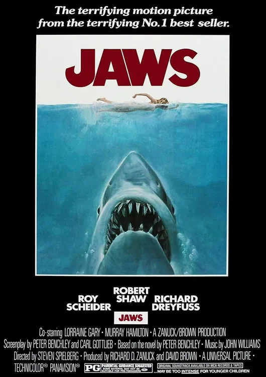
The first picture that pops into my head — and I would imagine yours too — is Roger Kastel’s poster for Jaws. It’s an iconic image, that both makes you want to see the film and not see the film at the same time! It was created in oils and really sums up Spielberg’s terrific movie so well. The exaggerated shark dimensions and the emergence of a unseen terror from below are the elements highlighted to entice you into the cinema. I have remained fascinated for years by the decision to use the word “terrifying” twice in the strap-line. It’s considered lazy writing practice to use the same word again in such proximity. It’s why I often end up reaching for the Thesaurus when my own vocabulary reaches its limits. But here the repetition works so well. Terror is what is emphasized here: so it re-enforces this facet. Another example that established rules and writing norms can and should be broken for the right idea.

Even today when I go near the sea, this image always jump into my head. Even if the coast of the UK is not known to house too many Great White sharks. Spielberg often cites this image as one of the key reasons Jaws went on to be such a commercial success and social phenomenon. It’s a stupendous image and a very clever piece of movie marketing.

© Jaws, Dir. Steven Spielberg, Universal Pictures, 1975, All rights reserved

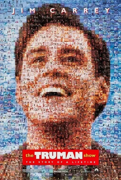
My second favourite image is perhaps one that is slightly less well cited in the movie poster pantheon: the collage image for The Truman Show. I remember at the time feeling a little jaded with going to the movies. I think most of the big summer releases had left me a little cold. I had lost my big screen mojo — and so by the time this gem of a movie hit UK cinemas in the Autumn of 1998 my expectations needed a bit of revitalization. I was always going to see this film anyway — Peter Weir is a fabulous Director whose films are always worth seeing — but regardless this is a fabulous poster. Unlike perhaps, Jaws which is designed to stick in your mind with one casual glance, this poster for The Truman Show is one that demands attention.

© The Truman Show, Dir. Peter Weir, Paramount, 1988, All rights reserved

Again, this is a great image in it’s own right. It perfectly reflects how the film’s central character, Truman, is made up of hundreds of separate filmed components — and yet there is still something artificial and unreal about it. The creation of this type of image was dependent in advances of computer technology. These type of images became common-place at the end of the 90’s, but it would have been virtually impossible in the 1980’s to design a poster in this way as the software would not have been up to the job. And I’ve long been fascinated in how advances in technology have shifted what become possible in art. This great image was designed by Dawn Baillie. There were other posters designed for this film (as there are often are) but this is the one that really sticks in my mind.

I loved the film when I saw it on its original release, and it helped get my movie going enchantment back into gear!

Submissions are open for the 7th annual Canadian Short Screenplay Competition.

The Early Bird Deadline is December 28th, 2025. The final deadline is April 26th, 2026. Get your entries in via FilmFreeway or also now courtesy of the fine folks over at Stage32, if you’re feeling so inclined to share your latest work.

Submit your short film script(s) today and prepare to take the first step on a talented production team potentially turning your words into pictures — and then encapsulated in a movie poster of your own.

Submissions are now open for the 7th annual Canadian Short Screenplay Competition. There is plenty of time, but the Early Bird Deadline of December 28th, 2025 will be here before you know it. So start planning now. Get your entries in via FilmFreeway.

Submit your script today and prepare to take your place on the global stage!

Written by Neil Graham

2025 #WW Laureate

SHORT. IS. BETTER.
Join the email list